The Mistakes Ecommerce Stores Make With Drag-and-Drop Interface
Your drag-and-drop bot flow looks clean on the canvas. Then a customer asks about a return on Instagram, and the bot sends them back to the main menu. Visual builders promise automation, but they break the moment a real conversation leaves the script. Anyone weighing the market should also review Whatsapp Business API.
This article covers where ecommerce stores go wrong with drag-and-drop interfaces: overestimating automation, designing around internal departments instead of buyer intent, ignoring how WhatsApp, Instagram and Messenger differ, and treating setup as finished at launch. You will also learn what to check in a platform before committing, including how Com.bot's Visual Bot Builder and unified inbox close these gaps.
Overestimating What Drag-and-Drop Can Automate
Drag-and-drop bot builders make it easy to assemble a conversation, but they don't automatically create intelligent dialogue. That still requires deliberate design. The visual editor lowers the technical barrier, which is genuinely valuable for an ecommerce store that wants a quick way to handle common questions, but lowering a barrier is not the same as removing the work.
Many businesses assume that because a flow looks complete on screen, it will behave intelligently in production. The result is a brittle bot that handles the happy path and collapses the moment a shopper phrases something in an unexpected way. A customer asking about a delayed delivery does not type the exact label from your flowchart.
This gap between visual simplicity and real conversational ability shows up in two specific mistakes. The first is treating a tidy flowchart as a replacement for conversation logic. The second is failing to plan what happens when the bot simply cannot help. Both are common, and both cost conversions.
Understanding these mistakes matters because a chatbot sits close to the checkout process and the wider customer journey. A bot that frustrates shoppers can push them toward cart abandonment, while one that resolves questions quickly supports the user experience you have worked to build across your product pages and site navigation.
Assuming visual flows replace conversation logic
A beautifully arranged flowchart is not a substitute for a well-designed conversation tree that accounts for intent, context, and user input variations. Conversation logic is the invisible layer that decides what a message actually means before any branch is triggered.
That layer has to handle several jobs at once. It needs to interpret user intent, tolerate synonyms and typos, carry context across multiple turns, and branch correctly based on what the shopper says. A drag-and-drop interface can display those branches, but it cannot invent them for you.
Consider a simple example. A flow that only recognizes the phrase "track order" will fail when a shopper types "where is my package?" or "has my stuff shipped yet?" The intent is identical. The wording is not. Without natural language processing behind the flow, the bot treats a perfectly reasonable question as noise.
Practical steps to close this gap:
- Use NLP within the bot builder so the system matches intent rather than exact keywords.
- Design each intent with multiple phrasings, including casual and misspelled versions.
- Test with real user inputs pulled from support tickets, chat logs, or search queries on your online shop.
- Review failed matches regularly and fold new phrasings back into the flow.
The principle is straightforward. Treat the drag-and-drop interface as a way to implement logic, not a way to replace it. The visual editor is where your thinking gets organized, not where it gets done for you.
Ignoring fallback paths when a bot cannot resolve a query
When a bot encounters a query it can't handle, the absence of a graceful fallback turns a minor hiccup into a lost customer. This is where many otherwise solid builds fall apart, because the failure path never got the same attention as the main flow.
The usual failures are predictable. A dead-end message like "I don't understand" leaves the shopper stranded. Looping back to the main menu feels like being sent in circles. Offering no route to a human agent removes the last chance to save the conversation.
Fallbacks deserve real design work, not a placeholder. A well-built fallback can offer to connect the shopper to a live agent, collect contact details for a follow-up, or surface related FAQs that might answer the question a different way. Each option keeps the customer journey moving instead of stopping it.
It also helps to measure how often fallbacks trigger and what happens next. Useful metrics include:
- Fallback rate, the share of conversations where the bot cannot match an intent.
- Escalation rate, how often conversations get handed to a person.
- Resolution time, how long it takes to close a question after a fallback occurs.
A rising fallback rate signals gaps in your intent coverage. A high escalation rate may mean the bot is attempting questions it should hand off sooner. Tracking both keeps the design honest.
The mindset shift is to see fallbacks as recovery opportunities rather than admissions of failure. Every shopper who hits a dead end and finds a helpful next step is a customer you kept, and that is exactly the outcome a drag-and-drop interface is supposed to support.
Building Interfaces Around the Store, Not the Customer Journey
Many bot interfaces mirror a company's org chart instead of the way customers actually shop, creating friction at every step. A visitor who wants to know where their package is does not think of themselves as a "Billing" or "Support" case. They think in tasks: find a product, check a delivery, send something back.
When the menu reflects internal structure, the customer has to translate a simple need into your company's vocabulary. That translation step is where confusion starts. Every extra guess adds friction, and friction at the menu level shapes how the rest of the visit unfolds.
This problem shows up in two common mistakes. The first is mapping menus to internal departments rather than buyer intent. The second is forgetting the steps that matter most in ecommerce, such as order tracking, returns and payment. Both mistakes share a root cause: the drag-and-drop interface was designed around the store's convenience, not the customer journey.
Fixing them does not require abandoning a visual editor or no-code platform. It requires deciding what belongs on the first screen a shopper sees. The sections below break down each mistake and what to do instead.
Mapping menus to internal departments instead of buyer intent
A menu that lists 'Sales,' 'Support,' and 'Billing' might make sense to your team, but it forces customers to translate their needs into your internal language. Someone with a damaged item does not know whether that is Support or Billing. They just want the problem solved.
Intent-based menus use the customer's own words. Common labels include:
- Browse Products
- Track My Order
- Returns & Refunds
- Talk to a Human
Behind the scenes, each of these intents can route to the right department. "Track My Order" might pull from order management, while "Returns & Refunds" reaches the same team that handles billing questions. The customer sees a task, the business sees a workflow.
To find the right labels, run user testing. Ask shoppers how they would phrase a request in their own words, then compare that language to your current menu. Natural phrasing varies by product category and audience, so test with real customers rather than guessing.
Navigation that matches buyer intent affects both conversion rate and satisfaction. When people find the right path quickly, they are more likely to continue toward checkout instead of abandoning the session. A drag-and-drop interface makes it easy to rename and reorder menu items, so this alignment is a design decision, not a technical one.
Forgetting order tracking, returns and payment steps in the flow
A bot that helps customers find products but can't process a return or track a shipment leaves the journey half-finished. Discovery is only one part of the customer journey. The tasks that follow a purchase often matter more to retention.
Essential ecommerce steps to build into the flow include:
- Order tracking with real-time status pulled from your order management system
- Returns and exchanges, including initiation and label generation
- Payment processing through a secure checkout that works inside the chat
Omitting these steps pushes customers toward other channels. They open a support ticket, send an email, or simply leave. That pattern raises cart abandonment and adds avoidable tickets for your team.
The fix is mostly integration work. Use APIs to connect the bot to order management and payment systems so status and transactions stay current. Then design flows that let customers complete these tasks without leaving the chat. A return should be startable and finishable in the same conversation.
Test each flow the way a shopper would use it, on mobile especially. If the checkout process breaks when the screen narrows, the drag-and-drop layout needs responsive breakpoints reviewed. A complete flow, from product page to payment to return, is what turns a helpful bot into a reliable one.
Neglecting Multi-Channel Consistency
Customers don't think in channels-they expect the same smooth experience whether they message you on WhatsApp, Instagram, or Facebook Messenger. That expectation collides with a hard reality: each platform has its own rules, layout conventions, and user habits. A drag-and-drop interface makes it easy to build a conversation flow once and publish it everywhere, and that convenience is exactly where the mistake begins.
Treating every channel as interchangeable ignores how people actually behave. A shopper browsing an online shop on Instagram may be in a discovery mindset, while someone messaging on WhatsApp is often closer to a purchase decision. The same message, tone, and structure rarely serve both.
Multi-channel inconsistency also damages the customer journey in quieter ways. Brand voice shifts, response times vary, and product answers differ between platforms. Over time, these small gaps erode trust and push buyers back toward a website builder checkout they already abandoned once.
Getting this right means accepting that a single drag-and-drop interface should produce channel-specific experiences, not identical copies. The two pitfalls below cover the most common ways ecommerce stores get this wrong.
Designing one flow for WhatsApp while Instagram and Messenger behave differently
A flow optimized for WhatsApp's quick replies may fall flat on Instagram, where users expect more visual and interactive elements. Each platform offers a distinct toolkit, and a drag-and-drop interface that ignores those differences produces awkward results.
The core constraints differ in practical ways:
- WhatsApp supports rich media, quick replies, and list messages, and it enforces a 24-hour messaging window that shapes how follow-ups must be structured.
- Instagram leans visual, with stories, reels, and DMs where imagery and short captions carry more weight than long text blocks.
- Facebook Messenger supports persistent menus and webviews, making it better suited to browsing product pages without leaving the conversation.
Message length and tone should shift with each channel too. A warm, chatty WhatsApp reply can feel bloated on Instagram, where a visual card with a one-line caption often performs better. On Messenger, a persistent menu can replace several back-and-forth messages entirely.
The practical fix is to build a shared core flow, then adapt the presentation layer per channel. A unified platform can help manage these differences without duplicating work, letting teams reuse logic while swapping in channel-appropriate elements.
Test each channel separately before launch. What reads well in a preview on one platform may break on another due to formatting, media sizing, or button limits. Cross-browser style checks and touch target reviews matter here just as they do for mobile responsiveness on a product page.
Losing context when customers switch channels mid-conversation
A customer who starts a conversation on Instagram and continues on WhatsApp expects the bot to remember what was discussed-but often it doesn't. Without a unified customer profile, each channel treats the same person as a brand new contact.
The result is a frustrating loop. The shopper repeats their question, re-explains their order issue, and re-states preferences already shared. This kind of friction is a common driver of cart abandonment, because buyers interpret repetition as a sign that no one is really listening.
Technically, the problem comes down to identity. Each platform issues its own user identifier, so a conversation on one channel has no built-in link to the same person on another. Bridging that gap requires deliberate design.
Practical solutions include:
- Using a unified inbox that consolidates conversations from every channel into one view for support teams.
- Implementing user identification across channels, typically through a phone number or email captured early in the flow.
- Designing flows that can hand off context, so a conversation summary travels with the customer when they switch platforms.
Cross-channel testing deserves real attention. Teams should simulate a journey that starts on one platform and finishes on another, checking whether order details, product interests, and prior answers carry through. This kind of testing also surfaces accessibility compliance gaps, since screen reader behavior and keyboard navigation vary across messaging apps.
Context loss is ultimately a UX design failure, not just a technical one. Stores that solve it see fewer repeated questions and shorter paths to checkout, while those that ignore it quietly lose buyers at the exact moment interest was highest.
Treating the Interface as a One-Time Setup
A bot is not a 'set it and forget it' tool. Customer needs, products, and policies evolve, and your flows must evolve with them. Teams that build a conversational flow once and walk away usually discover the problem months later, when customers are getting answers that no longer match reality.
The drag-and-drop interface makes building feel effortless, and that ease can create a false sense of completion. A finished canvas looks done. But a bot is closer to a living document than a static page, and the launch is the starting point, not the finish line.
Two oversights cause most of the damage. The first is skipping testing before the bot goes live. The second is failing to review and update flows as the catalog, pricing, and policies change. Both are easy to postpone and expensive to ignore.
Think of the difference between a product page and a support script. A product page can sit unchanged for a while without breaking. A support script that references a discontinued item, an old shipping window, or a retired promo will actively mislead people. Outdated information erodes trust faster than no information at all, because the customer acted on it.
Skipping testing before going live
Launching a bot without thorough testing is like opening a store without checking if the doors work. The store looks great from the sidewalk. Customers just cannot get in, or they walk into a room with no exits.
A practical testing checklist covers four layers. Each one catches a different class of failure:
- Unit tests for each flow branch. Walk every path a customer can take, including the ones you expect nobody to use.
- Integration tests with backend systems. Confirm that order lookups, inventory checks, and payment links return real data, not placeholders.
- User acceptance testing with real people. Hand the bot to colleagues or beta testers who have never seen the flow and watch where they hesitate.
- Edge-case testing. Try unexpected inputs, emojis, misspellings, multiple languages, and very long messages to see how the bot recovers.
A staging environment matters here. Testing in production means real customers become your testers, and their first impression of your online shop is a broken flow. Beta testers on a staging copy can break things safely.
Common issues surface quickly once you look for them: broken links to product pages, fallbacks that loop instead of escalating, and slow response times that make the bot feel abandoned. Response speed shapes user experience as much as the words on screen.
Testing should also cover every channel the bot runs on. A flow that works cleanly on desktop web can behave differently in a mobile app or messaging widget, where screen space and input methods change. Check mobile responsiveness and touch interactions, not just the desktop preview.
Failing to review and update flows as products and policies change
When you add a new product line or change your return policy, your bot's flows must be updated accordingly. Otherwise customers get outdated information, and the fallout lands on your support team.
The risks compound quietly. A retired item still shown as available drives frustrated orders. A payment link pointing to an old checkout page breaks the checkout process at the worst possible moment. A return window quoted from last year's policy can create compliance exposure and disputes your team has to unwind by hand.
A maintenance schedule keeps this manageable:
- Quarterly reviews of every major flow, regardless of whether anything changed.
- Immediate updates after any major product, pricing, or policy change.
- Ongoing monitoring of user feedback and analytics to spot drift between what the bot says and what customers need.
Set up alerts for the signals that matter. A spike in fallback rates usually means the bot is encountering questions it was never built to answer. A flow that fails outright should notify someone the same day, not the next quarter.
Version control for bot flows is worth the small upfront effort. When a change causes problems, you can see what shifted, compare versions, and roll back instead of rebuilding from memory. It also documents why a flow looks the way it does, which helps when teammates rotate in.
Treat the flow library like any other part of your customer journey. It needs an owner, a review cadence, and a record of changes. Bots that stay accurate are the ones someone is actively tending.
Choosing a Platform That Limits the Drag-and-Drop Builder
The platform you choose determines how far your drag-and-drop builder can take you-some are flexible and scalable, while others hit a wall quickly. An ecommerce store that picks a restrictive website builder often discovers the limits only after launch, when customer demand exposes gaps in channels, tools, or traffic capacity.
Not all bot platforms are created equal. Some drag-and-drop interfaces look polished in a demo but restrict customization, channel coverage, or integrations once you try to build something real. Others charge extra for every added channel or cap the number of actions a flow can perform.
For an online shop, those constraints ripple outward. A builder that cannot connect to your checkout process or product page data forces manual workarounds, which slows response times and hurts the customer journey. A builder that supports only one messaging channel fragments conversations across apps.
This section helps you evaluate platforms against the factors that matter most for ecommerce: which channels are supported, which tools connect natively, and whether the system scales as order volume grows. It then shows how Com.bot addresses these gaps directly.
What to check: channel coverage, integrations and scalability
Before committing to a bot platform, verify that its drag-and-drop builder supports the channels your customers use, integrates with your existing tools, and can grow with your business. Run through each factor below and ask vendors for specifics rather than accepting a feature page at face value.
- Channel coverage: Confirm support for WhatsApp, Instagram, Facebook Messenger, and a web widget. If your audience lives on one channel and the builder ignores it, your conversion rate suffers.
- Integrations: Check for native connections to ecommerce platforms, CRM systems, payment gateways, and helpdesk tools. A missing payment link turns a checkout process into a dead end.
- Scalability: Ask how many messages the system handles per day, whether you can add team members, and whether complex flows stay stable under load. A builder that buckles at peak season creates cart abandonment you never see in a demo.
- Customization: Look for custom code, API access, and white-labeling options. Without them, frontend customization stalls and your brand voice gets diluted.
Watch the fine print on pricing. Some platforms charge extra per channel or limit the number of actions a single flow can contain, which quietly raises costs as your online shop grows. Ask directly: what is included, what costs more, and what happens when traffic doubles.
Also test the builder on a small project first. A visual editor that feels intuitive with three steps may become unwieldy with thirty. WYSIWYG tools vary widely in how they handle branching logic, delays, and conditional responses, so confirm those capabilities before you migrate.
How Com.bot's Visual Bot Builder and unified inbox address these gaps
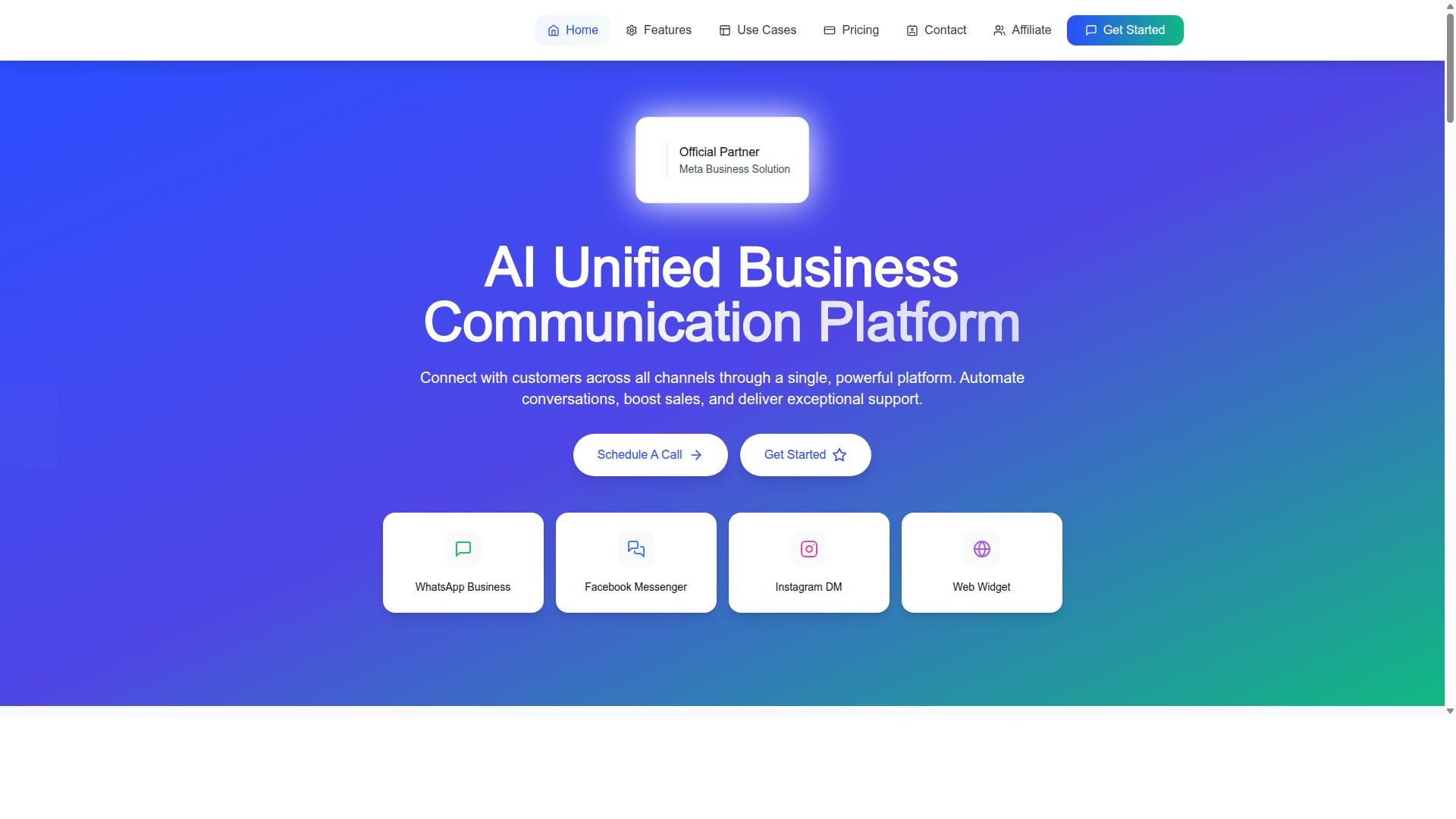
Com.bot's Visual Bot Builder and unified inbox are designed to overcome the common limitations of drag-and-drop platforms, offering broad channel coverage, native integrations, and enterprise-grade scalability. The builder uses a drag-and-drop interface, so teams can assemble flows without writing code.
The Unified Team Inbox brings WhatsApp, Facebook Messenger, Instagram DM, and web widget conversations into one place. That single view solves the context loss that happens when a customer messages on Instagram, then follows up on WhatsApp, and an agent cannot see the earlier exchange.
Com.bot also supports Native Payments for WhatsApp, letting an online shop handle transactions where the conversation already happens. Multi-channel support across WhatsApp, Facebook, and Instagram means the customer journey does not break when a shopper switches apps.
For growing stores, the numbers matter. Com.bot processes 25M+ messages per day and serves 23,000+ active customers, with official Meta Business Partner status. That combination speaks to capacity and platform credibility rather than a builder that hits a wall at scale. Automation Builder connects to 1000+ integrations, and the platform offers Team Collaboration with role-based access for larger support teams.
Pricing runs across Silver, Gold, and Platinum plans, with add-ons available for additional team members and channels. For an ecommerce store that wants one system for automation and communication, Com.bot pairs a flexible visual editor with the channel reach and integrations that restrictive builders lack.
Recommended Resources: